

In machine learning, most problems can put in one of two categories: unsupervised learning and supervised learning. In supervised learning tasks, you know what classes your data points belong to, which means that you can check the performance of your classifier on your dataset. In contrast, in an unsupervised learning task you don’t have specific class labels for your data and it is often up to the researcher to come up with meaningful correlations and explore potential patterns in the dataset using statistical techniques like regression.
In this post, I’m going to demonstrate the process of taking a dataset and carrying out regression on the dataset in order to predict some possible trends using Scikit-learn in Python. The post will also demonstrate the process of visualizing data with Pandas, Seaborn, and Matplotlib.
For this post, we’ll be using the video game sales dataset, available HERE.
As you might expect, we’ll start off by importing all the libraries we will need.
import matplotlib.pyplot as plt
import pandas as pd
import numpy as np
import seaborn as sns
from sklearn.model_selection import train_test_split
from sklearn.linear_model import LinearRegression, ElasticNet, Lasso, Ridge
from sklearn.tree import DecisionTreeRegressor
from sklearn.ensemble import RandomForestRegressor, AdaBoostRegressor
from sklearn.preprocessing import StandardScaler
from sklearn.decomposition import PCA
from sklearn.pipeline import Pipeline
Let’s start off by loading the data and checking the number of occurrences for features we might be interested in.
df = pd.read_csv("vgsales.csv")

# get an idea of the total number of occurences for important features

publishers = df['Publisher'].unique()
platforms = df['Platform'].unique()
genres = df['Genre'].unique()

print("Number of games: ", len(df))
print("Number of publishers: ", len(publishers))
print("Number of platforms: ", len(platforms))
print("Number of genres: ", len(genres))
Number of games:  16598
Number of publishers:  579
Number of platforms:  31
Number of genres:  12
We need to be sure that our data is free of any null values, so we’ll check for them and drop them if there are any.
print(df.isnull().sum())

# drop them if there are any
df = df.dropna()
Rank              0
Name              0
Platform          0
Year            271
Genre             0
Publisher        58
NA_Sales          0
EU_Sales          0
JP_Sales          0
Other_Sales       0
Global_Sales      0
dtype: int64
One of the first things we may try doing is checking to see how many global game sales there are a year. We can count how many years there are in the database, then we can plot the years against the global sales.
# if we wanted the counts instead, we could just use Count. Count returns the number of instances,
# not the sums of the values like above
x = df.groupby(['Year']).count()
x = x['Global_Sales']
y = x.index.astype(int)

plt.figure(figsize=(12,8))
colors = sns.color_palette("muted")
ax = sns.barplot(y = y, x = x, orient='h', palette=colors)
ax.set_xlabel(xlabel='Number of releases', fontsize=16)
ax.set_ylabel(ylabel='Year', fontsize=16)
ax.set_title(label='Game Releases Per Year', fontsize=20)

plt.show()

Let’s get an idea of how many games are published by specific publishers. There’s a lot of publishers in this list, so we want to drop any publishers that have published fewer than a chosen number of games. Let’s set 75 as a threshhold. We’ll also apply this same method to the platforms the games are published on.
After dropping much of the data, we can try plotting the remaining data that we’ve put into a new dataframe. We’ll plot the number of games published by both the most prolific publishers and the number published on different consoles.
vg_data = pd.read_csv('vgsales.csv')

print(vg_data.info())
print(vg_data.describe())

# let's choose a cutoff and drop any publishers that have published less than X games

for i in vg_data['Publisher'].unique():
    if vg_data['Publisher'][vg_data['Publisher'] == i].count() < 60:
        vg_data['Publisher'][vg_data['Publisher'] == i] = 'Other'

for i in vg_data['Platform'].unique():
    if vg_data['Platform'][vg_data['Platform'] == i].count() < 100:
        vg_data['Platform'][vg_data['Platform'] == i] = 'Other'

#try plotting the new publisher and platform data
sns.countplot(x='Publisher', data=vg_data)
plt.title("# Games Published By Publisher")
plt.xticks(rotation=-90)
plt.show()

plat_data = vg_data['Platform'].value_counts(sort=False)
sns.countplot(y='Platform', data=vg_data)
plt.title("# Games Published Per Console")
plt.xticks(rotation=-90)
plt.show()
RangeIndex: 16598 entries, 0 to 16597
Data columns (total 11 columns):
Rank            16598 non-null int64
Name            16598 non-null object
Platform        16598 non-null object
Year            16327 non-null float64
Genre           16598 non-null object
Publisher       16540 non-null object
NA_Sales        16598 non-null float64
EU_Sales        16598 non-null float64
JP_Sales        16598 non-null float64
Other_Sales     16598 non-null float64
Global_Sales    16598 non-null float64
dtypes: float64(6), int64(1), object(4)
memory usage: 1.4+ MB
None
               Rank          Year      NA_Sales      EU_Sales      JP_Sales  \
count  16598.000000  16327.000000  16598.000000  16598.000000  16598.000000
mean    8300.605254   2006.406443      0.264667      0.146652      0.077782
std     4791.853933      5.828981      0.816683      0.505351      0.309291
min        1.000000   1980.000000      0.000000      0.000000      0.000000
25%     4151.250000   2003.000000      0.000000      0.000000      0.000000
50%     8300.500000   2007.000000      0.080000      0.020000      0.000000
75%    12449.750000   2010.000000      0.240000      0.110000      0.040000
max    16600.000000   2020.000000     41.490000     29.020000     10.220000

        Other_Sales  Global_Sales
count  16598.000000  16598.000000
mean       0.048063      0.537441
std        0.188588      1.555028
min        0.000000      0.010000
25%        0.000000      0.060000
50%        0.010000      0.170000
75%        0.040000      0.470000
max       10.570000     82.740000


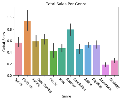
We can also try plotting variables against each other, like getting the global sales of games by their genre.
sns.barplot(x='Genre', y='Global_Sales', data=vg_data)
plt.title("Total Sales Per Genre")
plt.xticks(rotation=-45)
plt.show()
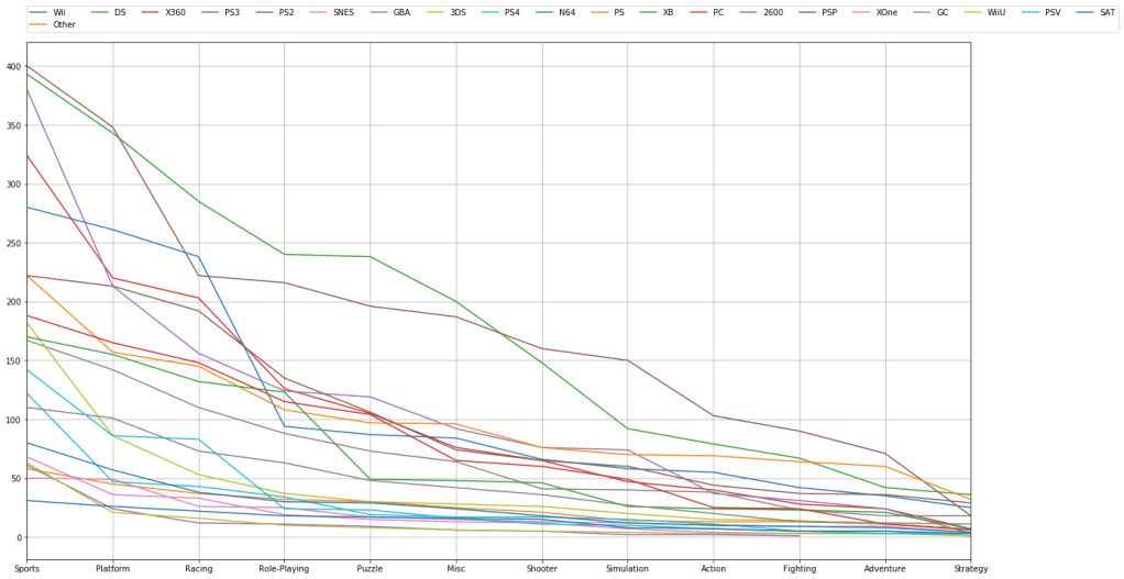
We can filter and plot by multiple criteria. If we wanted to check and see how many games are published in a given genre AND filter by platform we can do that. We just need to get the individual platforms, which we can do by filtering the “platform” feature with a “unique” function. Then we just have to plot the platform and genre data for each of those platforms.
# try visualizing the number of games in a specific genre
for i in vg_data['Platform'].unique():
    vg_data['Genre'][vg_data['Platform'] == i].value_counts().plot(kind='line', label=i, figsize=(20, 10), grid=True)

# set the legend and ticks

plt.legend(bbox_to_anchor=(0., 1.02, 1., .102), loc=3, ncol=20, borderaxespad=0.)
plt.xticks(np.arange(12), tuple(vg_data['Genre'].unique()))
plt.tight_layout()
plt.show()
Now that we’ve plotted some of the data, let’s try predicting some trends based off of the data. We can carry out linear regression to get an idea of how global sales figures could end up based on North American sales figures. First we need to separate our data into train and test sets. We’ll start by setting North American sales as our X variable and global sales as our Y variable, and then do train/test split.
# going to attempt to carry out linear regression and predict the global sales of games
# based off of the sales in North America

X = vg_data.iloc[:, 6].values
y = vg_data.iloc[:, 10].values

# train test split and split the dataframe

X_train, X_test, y_train, y_test = train_test_split(X, y, test_size=0.2, random_state=8)
The data needs to be reshaped in order to be compatible with Linear Regression, so we’ll do that with the following commands. We’re reshaping them into two long 2D arrays that have as many rows as necessary and a single column. After that we can fit the data in the Linear Regression function.
# reshape the data into long 2D arrays with 1 column and as many rows as necessary
X_train = X_train.reshape(-1, 1)
X_test = X_test.reshape(-1, 1)
y_train = y_train.reshape(-1, 1)
y_test = y_test.reshape(-1, 1)

lin_reg = LinearRegression()
lin_reg.fit(X_train, y_train)
LinearRegression(copy_X=True, fit_intercept=True, n_jobs=None, normalize=False)
Let’s check to see how our regression algorithm performed. We should plot the correlation between the variable’s training data, and plot the line of best fit from our regressor. We’ll then do the same thing for our testing data. Essentially we’re looking to see how the regression line fits both the training and testing data.
The regression lines should look approximately the same, and indeed they look fairly similar. The training set regression shows approximately 70 million sales for 40 million North American sales, while the test set regression may be just a little higher. We’ll also print the scores on the training and test sets, and see that our Linear Regression implementation had similar, though slightly worse accuracy on the testing set.
Let’s make a function to handle the plotting.
def plot_regression(classifier):

    plt.scatter(X_train, y_train,color='blue')
    plt.plot(X_train, classifier.predict(X_train), color='red')
    plt.title('(Training set)')
    plt.xlabel('North America Sales')
    plt.ylabel('Global Sales')
    plt.show()

    plt.scatter(X_test, y_test,color='blue')
    plt.plot(X_train, classifier.predict(X_train), color='red')
    plt.title('(Testing set)')
    plt.xlabel('North America Sales')
    plt.ylabel('Global Sales')
    plt.show()

plot_regression(lin_reg)
print("Training set score: {:.2f}".format(lin_reg.score(X_train, y_train)))
print("Test set score: {:.2f}".format(lin_reg.score(X_test, y_test)))


Training set score: 0.89
Test set score: 0.87
We can now implement some other regression algorithms and see how they perform. Let’s try using a Decision Tree regressor.
DTree_regressor = DecisionTreeRegressor(random_state=5)
DTree_regressor.fit(X_train, y_train)
plot_regression(DTree_regressor)

print("Training set score: {:.2f}".format(DTree_regressor.score(X_train, y_train)))
print("Test set score: {:.2f}".format(DTree_regressor.score(X_test, y_test)))


Training set score: 0.96
Test set score: 0.81
Now let’s try a Random Forest regressor algorithm.
RF_regressor = RandomForestRegressor(n_estimators=300, random_state=5)
RF_regressor.fit(X_train, y_train)
plot_regression(RF_regressor)

print("Training set score: {:.2f}".format(RF_regressor.score(X_train, y_train)))
print("Test set score: {:.2f}".format(RF_regressor.score(X_test, y_test)))


Training set score: 0.94
Test set score: 0.84
It looks like Random Forest and plain Linear Regression have comparable performance. However, we might be able to find a regression algorithm that performs better than these two. We’ll use a type of dimensionality reduction called Principal Component Analysis, which tries to distill the important features of a training set down to just the features that have the most influence on the labels/outcome. By reducing the dimensionality/complexity of a featureset, a representation that contains the features with the most predictive power is created. This can improve the predictive power of a regressor.
We’ll create a Scikit-learn Pipeline, which allows us to specify what kind of regression algorithm we want to use (Linear Regression) and how we want to set up the features for it (use the Standard Scaler and PCA).
Note that there’s only one feature we’re predicting off of here, North American sales, so PCA can’t simplify the representation anymore. But if we had more features we were doing regression on PCA could be useful.
components = [
    ('scaling', StandardScaler()),
    ('PCA', PCA()),
    ('regression', LinearRegression())
]

pca = Pipeline(components)
pca.fit(X_train, y_train)
plot_regression(pca)
print("Training set score: {:.2f}".format(pca.score(X_train, y_train)))
print("Test set score: {:.2f}".format(pca.score(X_test, y_test)))


Training set score: 0.89
Test set score: 0.87
We’re now going to try using different regression algorithms to see what kinds of results we get. Let’s try an Elastic Net regressor.
elastic = ElasticNet()
elastic.fit(X_train, y_train)
plot_regression(elastic)
print("Training set score: {:.2f}".format(elastic.score(X_train, y_train)))
print("Test set score: {:.2f}".format(elastic.score(X_test, y_test)))


Training set score: 0.54
Test set score: 0.51
Now let’s try Ridge regression.
ridge_reg = Ridge()
ridge_reg.fit(X_train, y_train)
plot_regression(ridge_reg)
print("Training set score: {:.2f}".format(ridge_reg.score(X_train, y_train)))
print("Test set score: {:.2f}".format(ridge_reg.score(X_test, y_test)))


Training set score: 0.89
Test set score: 0.87
Here’s a Lasso regression implementation.
lasso_reg = Lasso()
lasso_reg.fit(X_train, y_train)
plot_regression(lasso_reg)
print("Training set score: {:.2f}".format(lasso_reg.score(X_train, y_train)))
print("Test set score: {:.2f}".format(lasso_reg.score(X_test, y_test)))


Training set score: 0.38
Test set score: 0.36
Finally, let’s try using AdaBoost regression.
# ADA Boost regressor
ada_reg = AdaBoostRegressor()
ada_reg.fit(X_train, y_train)
plot_regression(ada_reg)

print("Training set score: {:.2f}".format(ada_reg.score(X_train, y_train)))
print("Test set score: {:.2f}".format(ada_reg.score(X_test, y_test)))


Training set score: 0.89
Test set score: 0.81
It looks like Ridge Regression and AdaBoost did the best at predicting the trend.
Thank you for reading through this demonstration of visualizing data and predicting data trends. If you’d like to go further and enhance your understanding of regression algorithms, I suggest checking the documentation for each of the algorithms in Scikit-learn. You can experiment with implementing these techniques on another dataset and altering the regression arguments.
