These are the results of a clustering analysis run on the Gapminder dataset. The features used to generate the three classes/categories include: alcohol consumption, breast cancer rate, employ rate, internet use rate, life expectancy, and urbanization rate.
After preprocessing the data, which includes scaling the features, it is separated into a training and testing data sets.
from sklearn.preprocessing import scale, MinMaxScaler
import pandas as pd
from seaborn import regplot
import matplotlib.pyplot as plt
import numpy as np
from sklearn.model_selection import train_test_split
from sklearn.cluster import KMeans
from scipy.spatial.distance import cdist
from sklearn.decomposition import PCA
import statsmodels.api as sm
# check for missing data
def check_missing(dataframe, cols):
for col in cols:
print("Column {} is missing:".format(col))
print((dataframe[col].values == ' ').sum())
print()
# convert to numeric
def to_numeric(dataframe, cols):
for col in cols:
dataframe[col] = pd.to_numeric(dataframe[col], errors='coerce')
# check frequency distribution
def freq_dist(dataframe, cols, norm_cols):
for col in cols:
print("Fred dist for: {}".format(col))
count = dataframe[col].value_counts(sort=False, dropna=False)
print(count)
for col in norm_cols:
print("Fred dist for: {}".format(col))
count = dataframe[col].value_counts(sort=False, dropna=False, normalize=True)
print(count)
df = pd.read_csv("gapminder.csv")
#print(dataframe.head())
#print(df.isnull().values.any())
cols = ['lifeexpectancy', 'breastcancerper100th', 'suicideper100th']
norm_cols = ['internetuserate', 'employrate', 'incomeperperson']
df2 = df.copy()
to_numeric(df2, cols)
to_numeric(df2, norm_cols)
df_clean = df2.dropna()
def plot_regression(x, y, data, label_1, label_2):
reg_plot = regplot(x=x, y=y, fit_reg=True, data=data)
plt.xlabel(label_1)
plt.ylabel(label_2)
plt.show()
def group_incomes(row):
if row['incomeperperson'] <= 744.23:
return 1
elif row['incomeperperson'] <= 942.32:
return 2
else:
return 3
df_clean['income_group'] = df_clean.apply(lambda row: group_incomes(row), axis=1)
scaler = MinMaxScaler()
X = df_clean[['alcconsumption','breastcancerper100th','employrate', 'internetuserate','lifeexpectancy','urbanrate']]
X.astype(float)
#print(X["internetuserate"].mean(axis=0))
X['internetuserate_scaled'] = scale(X['internetuserate'])
X['urbanrate_scaled'] = scale(X['urbanrate'])
X['lifeexpectancy_scaled'] = scale(X['lifeexpectancy'])
X['employrate_scaled'] = scale(X['employrate'])
X['alconsumption'] = scale(X['alcconsumption'])
X['breastcancerper100th'] = scale(X['breastcancerper100th'])
#print(X['internetuserate'].mean(axis=0))
#print(X['internetuserate_scaled'].mean(axis=0))
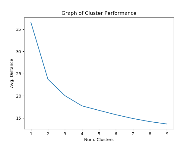
X_train, X_test = train_test_split(X, test_size=0.25)Afterwards, the model is tested on the dataset to determine which number of clusters seems to give the best performance.
clusters = range(1, 10)
mean_dist = []

for i in clusters:
    model = KMeans(n_clusters=i)
    model.fit(X_train)
    clus_assign = model.predict(X_train)
    mean_dist.append(sum(np.min(cdist(X_train, model.cluster_centers_, 'euclidean'),
                                axis=1))/X_train.shape[0])


plt.plot(clusters, mean_dist)
plt.xlabel("Num. Clusters")
plt.ylabel("Avg. Distance")
plt.title("Graph of Cluster Performance")
plt.show()
Around 4 clusters seems to give the best results that might guard against overfitting.
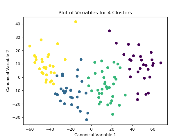
Afterwards, the model is run again with 4 clusters, this time with the PCA transformed variables passed in as the labels. After the optimized model is run, the means for the different classes are examined for meaningful patterns. The number of observations for each class is then distinguished and printed as the “cluster” variable. Finally, the means for the different clusters are calculated and the variable means for the different clusters can be explored.
K_means_model = KMeans(n_clusters=4)
K_means_model.fit(X_train)
clus_assign = K_means_model.predict(X_train)

pca_2 = PCA(2)
plot_columns = pca_2.fit_transform(X_train)
plt.scatter(x=plot_columns[:,0], y=plot_columns[:,1], c=K_means_model.labels_)
plt.xlabel("Canonical Variable 1")
plt.ylabel("Canonical Variable 2")
plt.title("Plot of Variables for 3 Clusters")
plt.show()

# check pattern of means by cluster to see if the means are distinct and meaningful
# create unique identifiers from the index of cluster training data
X_train.reset_index(level=0, inplace=True)
cluster_list = list(X_train['index'])
labels = list(K_means_model.labels_)
new_dict = dict(zip(cluster_list, labels))
print(new_dict)
new_cluster = pd.DataFrame.from_dict(new_dict, orient='index')
print(new_cluster)

# create unique identifiers for cluster assignment variable
# rename cluster assignment column
new_cluster.columns = ["cluster"]
new_cluster.reset_index(level=0, inplace=True)
merged_train = pd.merge(X_train, new_cluster, on='index')
print(merged_train.head(20))
print(merged_train.cluster.value_counts())

# we can now calculate means of variables for the different clusters
cluster_group = merged_train.groupby('cluster').mean()
print("Clustering variable means by cluster")
print(cluster_group)
Here are the results of the code:
{188: 2, 95: 3, 42: 0, 84: 1, 192: 2, 102: 2, 208: 2, 175: 1, 77: 0, 55: 0, 11: 3, 136: 1, 196: 3, 210: 2, 54: 3, 58: 2, 186: 0, 81: 0, 207: 3, 53: 3, 50: 1, 66: 0, 9: 1, 62: 0, 154: 3, 44: 3, 26: 3, 12: 3, 168: 2, 203: 1, 133: 2, 10: 1, 152: 0, 4: 0, 86: 2, 212: 2, 69: 1, 174: 1, 173: 1, 72: 3, 150: 0, 21: 2, 211: 2, 80: 2, 116: 3, 104: 1, 89: 0, 28: 2, 201: 1, 183: 2, 38: 0, 140: 0, 19: 2, 197: 0, 57: 2, 79: 2, 18: 0, 151: 3, 17: 1, 45: 0, 70: 0, 15: 1, 41: 2, 60: 2, 182: 3, 97: 2, 59: 1, 29: 2, 180: 2, 146: 2, 190: 2, 46: 3, 130: 3, 48: 3, 105: 3, 205: 2, 68: 0, 204: 3, 156: 1, 200: 3, 195: 3, 113: 3, 96: 0, 114: 2, 32: 1, 78: 2, 148: 3, 106: 2, 185: 1, 94: 1, 149: 2, 122: 2, 100: 1, 63: 1, 153: 3, 33: 0, 14: 2, 139: 1, 179: 1, 135: 2, 36: 2, 35: 2, 118: 2, 202: 1, 111: 1, 176: 2, 194: 2, 189: 2, 107: 0, 91: 1, 144: 1, 67: 0, 25: 3, 64: 1, 178: 0, 124: 3, 13: 3, 159: 3, 27: 3}
     0
188  2
95   3
42   0
84   1
192  2
..  ..
178  0
124  3
13   3
159  3
27   3

[119 rows x 1 columns]
    index alcconsumption  ...  alconsumption  cluster
0     188           3.39  ...      -0.695805        2
1      95            .65  ...      -1.245141        3
2      42           4.46  ...      -0.481284        0
3      84          16.12  ...       1.856402        1
4     192           1.92  ...      -0.990522        2
5     102           4.72  ...      -0.429157        2
6     208           3.91  ...      -0.591552        2
7     175          14.94  ...       1.619826        1
8      77            7.1  ...       0.048004        0
9      55            .32  ...      -1.311302        0
10     11          13.34  ...       1.299046        3
11    136           9.75  ...       0.579296        1
12    196           3.02  ...      -0.769986        3
13    210             .2  ...      -1.335361        2
14     54           9.43  ...       0.515140        3
15     58           1.64  ...      -1.046659        2
16    186           1.49  ...      -1.076732        0
17     81           5.92  ...      -0.188572        0
18    207            7.6  ...       0.148247        3
19     53           6.28  ...      -0.116396        3

[20 rows x 13 columns]
2    39
3    29
1    28
0    23
Name: cluster, dtype: int64
Clustering variables means by cluster
              index  breastcancerper100th  ...  employrate_scaled  alconsumption
cluster                                    ...
0         87.869565             -0.456400  ...          -0.000201      -0.291431
1        108.535714              1.297299  ...           0.010051       0.732239
2        119.205128             -0.673682  ...           0.459523      -0.636122
3        105.620690              0.096920  ...          -0.479776       0.225055

[4 rows x 10 columns]
Ignoring the index, we can look at some of the results for the column. It looks like, for example, observations in cluster 1 seem to have a higher likelihood of having high breast cancer rates compared to the other clusters. Meanwhile, observations in cluster 2 tended to have much lower alcohol consumption rates than average.
