
In this post I’ll be using exploratory data analysis techniques on the Gapminder dataset. I’ll be graphing some of the features in the dataset, with the primary variables of interest being Internet Use Rate and Life Expectancy. I’ve also included some analysis of secondary variables of interest, including Breast Cancer Rates Per 100k and Employment Rates.
To begin with, here’s the code I used to make the visualizations:
import seaborn as sns
import pandas as pd
import matplotlib.pyplot as plt

# check for missing data
def check_missing(dataframe, cols):

    for col in cols:
       print("Column {} is missing:".format(col))
       print((dataframe[col].values == ' ').sum())
       print()

# convert to numeric
def to_numeric(dataframe, cols):

    for col in cols:
        dataframe[col] = dataframe[col].convert_objects(convert_numeric=True)

# check frequency distribution
def freq_dist(dataframe, cols, norm_cols):

    for col in cols:
        print("Fred dist for: {}".format(col))
        count = dataframe[col].value_counts(sort=False, dropna=False)
        print(count)

    for col in norm_cols:
        print("Fred dist for: {}".format(col))
        count = dataframe[col].value_counts(sort=False, dropna=False, normalize=True)
        print(count)


df = pd.read_csv("gapminder.csv")

#print(dataframe.head())
#print(df.isnull().values.any())

cols = ['lifeexpectancy', 'breastcancerper100th', 'suicideper100th']
norm_cols = ['internetuserate', 'employrate']

df2 = df.copy()

#check_missing(df, cols)
#check_missing(df, norm_cols)

to_numeric(df2, cols)
to_numeric(df2, norm_cols)

#freq_dist(df2, cols, norm_cols)

def bin(dataframe, cols):

    for col in cols:
        new_col_name = "{}_bins".format(col)
        dataframe[new_col_name] = pd.qcut(dataframe[col], 10, labels=["1=10%", "2=20%", "3=30%", "4=40%", "5=50%",
                                                                     "6=60%", "7=70%", "8=80", "9=90%", "10=100%"])

df3 = df2.copy()
#bin(df3, cols)
bin(df3, norm_cols)

df_employ = df3[["employrate_bins"]]
print(df_employ)

sns.distplot(df3['lifeexpectancy'].dropna())
plt.title("Life Expectancy Distribution")
plt.show()
sns.distplot(df3['internetuserate'].dropna())
plt.title("Internet Use Rate Distribution")
plt.show()
sns.countplot(x = "employrate_bins", data=df_employ)
plt.title("Distribution of Employment Rates")
plt.show()

sns.lmplot(x = "internetuserate", y="breastcancerper100th", hue="internetuserate_bins", data=df3, fit_reg=False)
plt.title("Internet Use Rate and Breast Cancer Per 100k")
plt.show()

sns.lmplot(x = "internetuserate", y="lifeexpectancy", hue="internetuserate_bins", data=df3, fit_reg=False)
plt.title("Internet Use Rate and Life Expectancy")
plt.show()

sns.lmplot(x = "internetuserate", y="employrate", hue="internetuserate_bins", data=df3, fit_reg=False)
plt.title("Internet Use Rate and Employment Rate")
plt.show()
Now let’s take a look at the visualizations themselves.
To begin with, here’s a distribution of life expectancy for the approximately 210+ countries tracked in the dataset.

The data is (arguably) bimodal, with two peaks. The first large peak is clustered around 70 years of age while a second smaller cluster is around 50 years of age.
Now let’s have a look at the distribution for internet use rates.
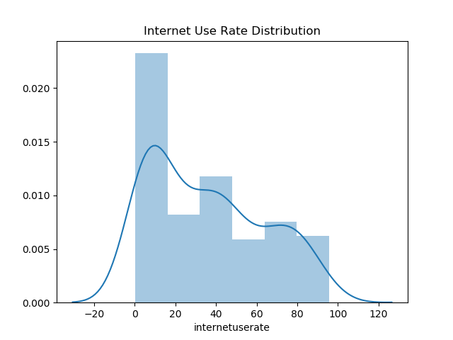
The largest peak by far is between 0 – 10% internet use rate. This looks to be about 25% of the data distribution overall, so most countries have less internet access for less than half their population. I’d argue that the data is a unimodel distribution, although I suppose a second smaller peak is found at the 40% mark.
Let’s try graphing some of the binned data, which includes binned employment rates.
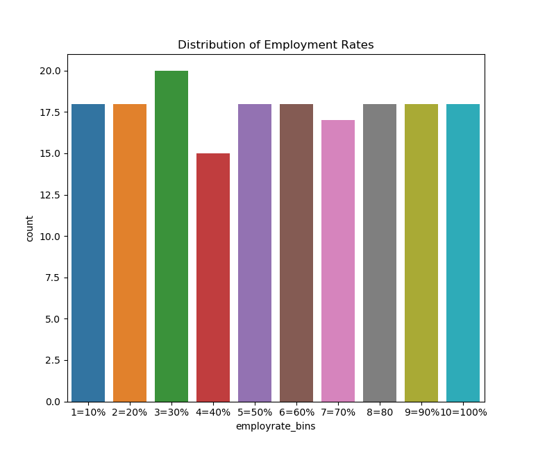
If we do this we can see that the data is fairly uniformally distributed, which we would expect given how the qcut function in Python works. However, there is a small bump around the 30th percentile and a small fall near the 40th percentile.
Now let’s try creating scatter plots for the continuous variables. First, we’ll try plotting the relationship between breast cancer diagnosis per 100k and internet use rate.
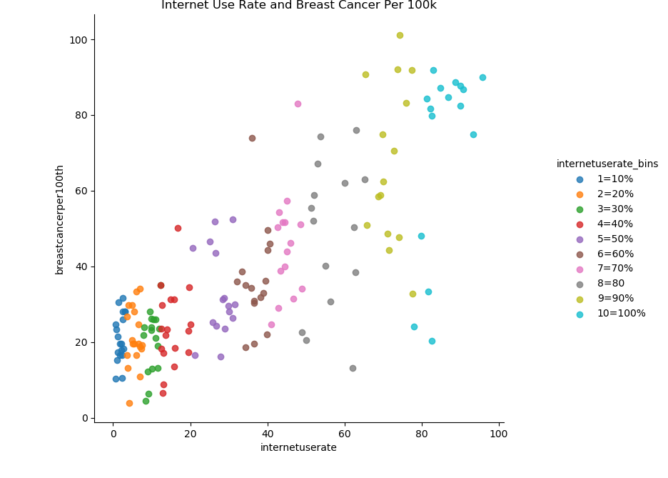
There seems to be a strong positive correlation between internet use rate and breast cancer diagnosis rates. Here’s an example of why we should be careful about inferring causation from correlation. It’s highly unlikely there’s some kind of causal mechanism between internet usage and breast cancer rates.
Now let’s try graphing the relationship between internet use rate and life expectancy.
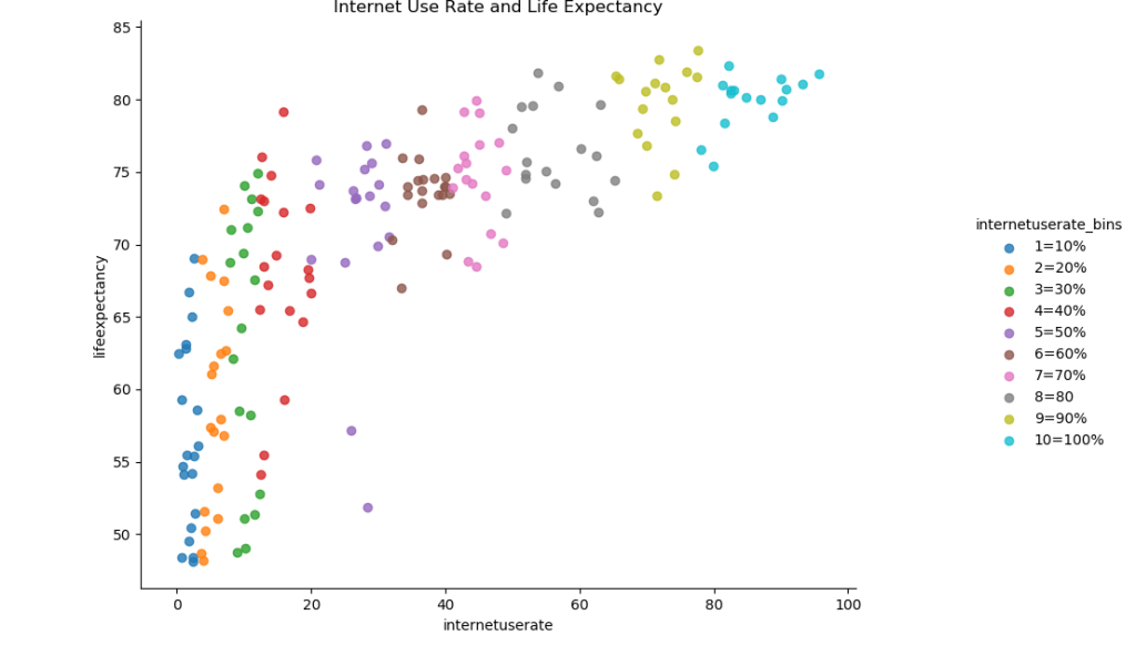
There also seems to be a roughly positive correlation between internet use rate and life expectancy. There’s a massive increase in life expectancy as internet use rises from 0 to 20%, followed by a slower increase.
Now let’s try graphing the relationship between internet use and employment rates.

Here’s something I was a little surprised to find. It looks as if there’s a relationship between internet use and employment rate that’s roughly parabolic in nature. It looks as if there’s a decline in employment rate internet saturation increases up until the approximately 50% mark, and then the rate increases again.
