
I am running a multi-regression model on the Gapminder dataset. Our dependent variable under study is life expectancy, while the independent variables we are investigating are “internet use rate”, “urbanization rate”, and “employment rate”.
First, we’re going to load in the data and do any necessary preprocessing of the dataset. This includes scaling the features of interest.
from sklearn.preprocessing import scale, MinMaxScaler
import statsmodels.formula.api as smf
from scipy.stats import pearsonr
import pandas as pd
from seaborn import regplot
import matplotlib.pyplot as plt
import statsmodels.api as sm

# check for missing data
def check_missing(dataframe, cols):

    for col in cols:
       print("Column {} is missing:".format(col))
       print((dataframe[col].values == ' ').sum())
       print()

# convert to numeric
def to_numeric(dataframe, cols):

    for col in cols:
        dataframe[col] = dataframe[col].convert_objects(convert_numeric=True)

# check frequency distribution
def freq_dist(dataframe, cols, norm_cols):

    for col in cols:
        print("Fred dist for: {}".format(col))
        count = dataframe[col].value_counts(sort=False, dropna=False)
        print(count)

    for col in norm_cols:
        print("Fred dist for: {}".format(col))
        count = dataframe[col].value_counts(sort=False, dropna=False, normalize=True)
        print(count)


df = pd.read_csv("gapminder.csv")

#print(dataframe.head())
#print(df.isnull().values.any())

cols = ['lifeexpectancy', 'breastcancerper100th', 'suicideper100th']
norm_cols = ['internetuserate', 'employrate', 'incomeperperson']

df2 = df.copy()

to_numeric(df2, cols)
to_numeric(df2, norm_cols)

df_clean = df2.dropna()

def plot_regression(x, y, data, label_1, label_2):

    reg_plot = regplot(x=x, y=y, fit_reg=True, data=data)
    plt.xlabel(label_1)
    plt.ylabel(label_2)
    plt.show()

def group_incomes(row):
    if row['incomeperperson'] <= 744.23:
        return 1
    elif row['incomeperperson'] <= 942.32:
        return 2
    else:
        return 3

df_clean['income_group'] = df_clean.apply(lambda row: group_incomes(row), axis=1)

scaler = MinMaxScaler()

X = df_clean[['alcconsumption','breastcancerper100th','employrate', 'internetuserate','lifeexpectancy','urbanrate']]
X.astype(float)

print(X["internetuserate"].mean(axis=0))

X['internetuserate_scaled'] = scale(X['internetuserate'])
X['urbanrate_scaled'] = scale(X['urbanrate'])
X['lifeexpectancy_scaled'] = scale(X['lifeexpectancy'])
X['employrate_scaled'] = scale(X['employrate'])

print(X['internetuserate'].mean(axis=0))
print(X['internetuserate_scaled'].mean(axis=0))
Now that we’ve scaled the features, we can run a multiple linear regression on the chosen features. We’ll also visualize the results of the residuals by creating some plots. We’ll create a QQ plot, a residual plot, and a influence/leverage plot.
print("Mult. Regression model findings:")
mult_lin_reg = smf.ols("lifeexpectancy_scaled ~ internetuserate_scaled + urbanrate_scaled + employrate_scaled", data=X).fit()
print(mult_lin_reg.summary())
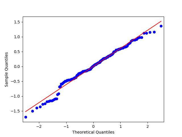
qq_plot = sm.qqplot(mult_lin_reg.resid, line='r')
plt.show()
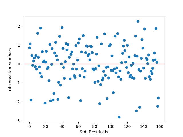
stdres = pd.DataFrame(mult_lin_reg.resid_pearson)
stdres_fig = plt.plot(stdres, 'o', ls='None')
l = plt.axhline(y=0, color='r')
plt.xlabel('Std. Residuals')
plt.ylabel('Observation Numbers')
plt.show()
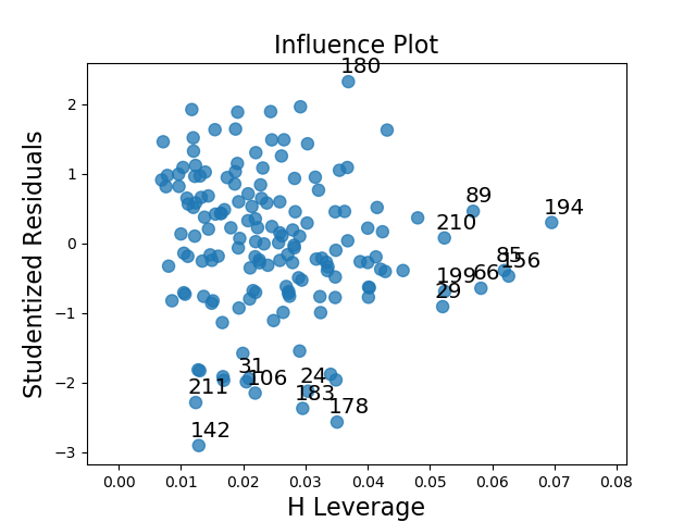
lev_plot = sm.graphics.influence_plot(mult_lin_reg, size=8)
plt.show()
1) Discuss the results for the associations between all of your explanatory variables and your response variable. Make sure to include statistical results (Beta coefficients and p-values) in your summary.
The response variable is Life Expectancy, while the explanatory varaibles are Internet Use Rate, Urbanization Rate, and Employment rate. All three explanatory variables seem to have a signficant P-value, with a P-value of ~0, 0.003, and 0.012 for InternetUseRate, UrbanRate, and EmployRate respectively. Checking the beta coefficients for the three explanatory variables gives us some insight into the degrees of change for the three variables. InternetUseRate has a coefficient of approximately 0.60. Meanwhile, UrbanRate has about a third of the relationship strength that InternetUseRate does. Employrate seems to have a slightly negative relationship with the response variable when checking just the coefficient, though if the two variables are graphed it shows that it has a non-linear, parabolic relationship.
2) Report whether your results supported your hypothesis for the association between your primary explanatory variable and the response variable.
The hypothesis was that internet use rate was positively correlated with life expectancy, and the multiple regression model seems to support this hypothesis.
3) Discuss whether there was evidence of confounding for the association between your primary explanatory and response variable (Hint: adding additional explanatory variables to your model one at a time will make it easier to identify which of the variables are confounding variables);
As none of the three tested variables had a P-value of greater than 0.05, it doesn’t seem that there is any evidence of confounding variables.
4) Generate the following regression diagnostic plots:
a) q-q plot
b) standardized residuals for all observations
c) leverage plot
d) Write a few sentences describing what these plots tell you about your regression model in terms of the distribution of the residuals, model fit, influential observations, and outliers.
The QQ plot indicates that there is a fairly tight fit to the distribution line, though the points deviate off of it at the lower and upper ends. This seems to indicate that the data is roughly normally distributed, but not perfectly normally distributed. Including other, higher order, variables in the regression model might help better capture the relationship.
The standardized residual graph shows that the vast majority of instances in the dataset have residuals that fall within two standard deviations from the mean, which fits the expectations for a normal distribution. It doesn’t look like any data points fall outside of three standard deviations from the mean, though there are some potential outliers. The model’s fit could potentially be improved by adding in new variables that might impact the relationships with the dependent variable.
The leverage plot suggests that there are a handful of outliers that have a notable, though not overwhelming, influence on the model’s estimations (points 183, 178, and 180). There also appear to be some instances which have a powerful impact on the model’s estimations, though in general they are not outliers as they do not fall outside of 1 standard deviation from the mean (the cluster on the far right of the graph).
