I’m going to be doing an analysis on the Gapminder dataset. I’ll be looking at the relationship between the internet usage rate and the life expectancy variables, as well as the association between internet usage and employment rates.
Here’s the code used to produce the visualizations and run the Pearson correlation on the chosen variables in the Gapminder dataset.
import statsmodels.formula.api as smf import statsmodels.stats.multicomp as multi from scipy.stats import pearsonr import pandas as pd from seaborn import regplot import matplotlib.pyplot as plt
# check for missing data def check_missing(dataframe, cols):
for col in cols: print("Column {} is missing:".format(col)) print((dataframe[col].values == ' ').sum()) print()
# convert to numeric def to_numeric(dataframe, cols):
for col in cols: dataframe[col] = dataframe[col].convert_objects(convert_numeric=True)
# check frequency distribution def freq_dist(dataframe, cols, norm_cols):
for col in cols: print("Fred dist for: {}".format(col)) count = dataframe[col].value_counts(sort=False, dropna=False) print(count)
for col in norm_cols: print("Fred dist for: {}".format(col)) count = dataframe[col].value_counts(sort=False, dropna=False, normalize=True) print(count)
print('Association between life expectancy and internet use rate') print(pearsonr(df_clean['lifeexpectancy'], df_clean['internetuserate']))
print('Association between employment rate and internet use rate') print(pearsonr(df_clean['employrate'], df_clean['internetuserate']))
Here’s the plots that were rendered:
Here’s the output of the Pearson correlation:
Association between life expectancy and internet use rate (0.77081050888289, 5.983388253650836e-33)
— Association between employment rate and internet use rate (-0.1950109538173115, 0.013175901971555317)
Based on the information above, it looks like life expectancy and internet use rate have a very strong correlation that is highly unlikely to be of chance. Meanwhile, employment rate and internet use see a less robust, though significant correlation. There’s a weak negative correlation for the second two variables.
For the Gapminder data I’m investigating whether or not there is a relationship between internet use rate and life expectancy. Because both of the variables are continuous in nature, I start off by binning both the variables. Internet use rate is binned into just two groups: less than 50% of the population with internet access and over 50% internet access. Meanwhile, life expectancy is divided into 10 bins.
import pandas as pd import scipy.stats
# check for missing data def check_missing(dataframe, cols):
for col in cols: print("Column {} is missing:".format(col)) print((dataframe[col].values == ' ').sum()) print()
# convert to numeric def to_numeric(dataframe, cols):
for col in cols: dataframe[col] = dataframe[col].convert_objects(convert_numeric=True)
# check frequency distribution def freq_dist(dataframe, cols, norm_cols):
for col in cols: print("Fred dist for: {}".format(col)) count = dataframe[col].value_counts(sort=False, dropna=False) print(count)
for col in norm_cols: print("Fred dist for: {}".format(col)) count = dataframe[col].value_counts(sort=False, dropna=False, normalize=True) print(count)
We now make recode dictionaries and set up crosstab calculations for four different tests. We’ll only be testing four different comparisons here, just as a proof of concept and to demonstrate that we know to carry out the calculations.
Notice that the p-values for the 3 vs. 7 and 2 vs. 8 categories are much smaller than the p-values for 6 vs. 9 and 4 vs. 7. However, the P-values for all the tests are fairly small.
In this post I run an analysis of variance (ANOVA) on the Gapminder dataset. Because the Gapminder data contains mainly continous values and not categorical ones, I had to create categorical values using the “qcut” function from Python’s Pandas library. Let’s take a look at the code used to load, preprocess, and bin the data.
import statsmodels.formula.api as smf import statsmodels.stats.multicomp as multi import pandas as pd
# check for missing data def check_missing(dataframe, cols):
for col in cols: print("Column {} is missing:".format(col)) print((dataframe[col].values == ' ').sum()) print()
# convert to numeric def to_numeric(dataframe, cols):
for col in cols: dataframe[col] = dataframe[col].convert_objects(convert_numeric=True)
# check frequency distribution def freq_dist(dataframe, cols, norm_cols):
for col in cols: print("Fred dist for: {}".format(col)) count = dataframe[col].value_counts(sort=False, dropna=False) print(count)
for col in norm_cols: print("Fred dist for: {}".format(col)) count = dataframe[col].value_counts(sort=False, dropna=False, normalize=True) print(count)
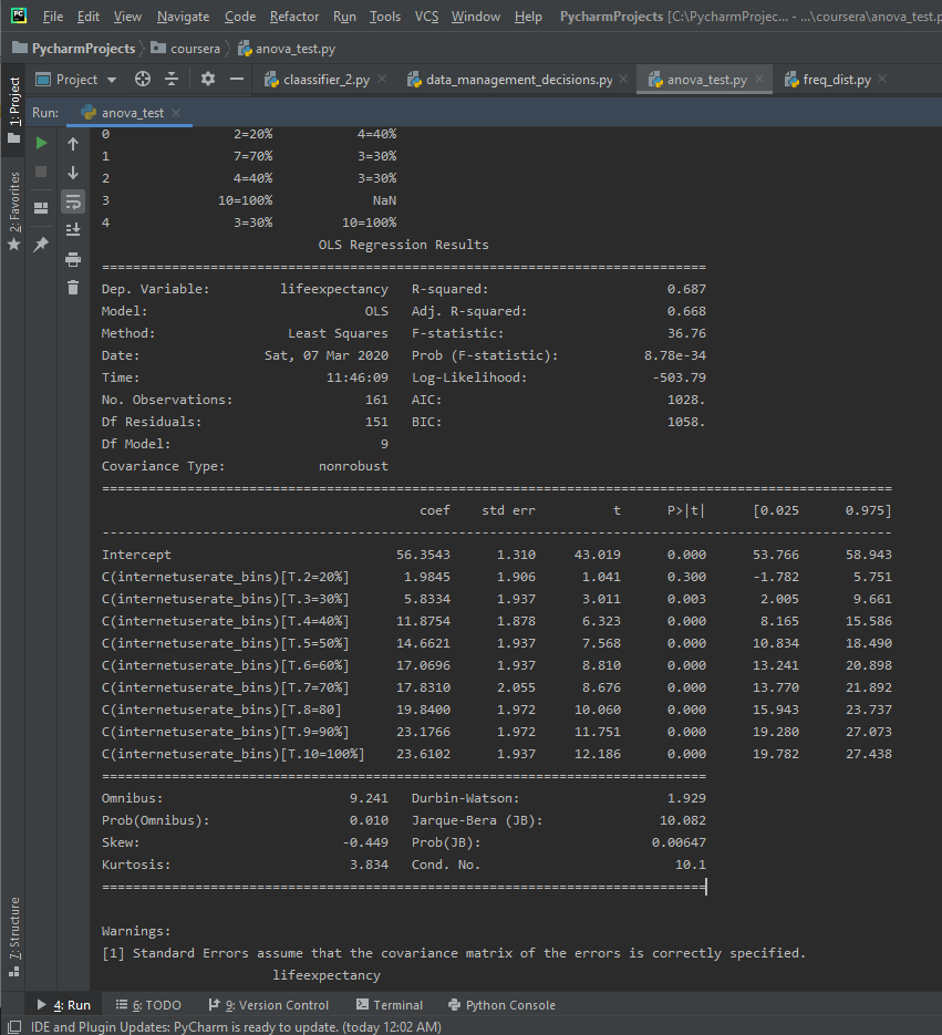
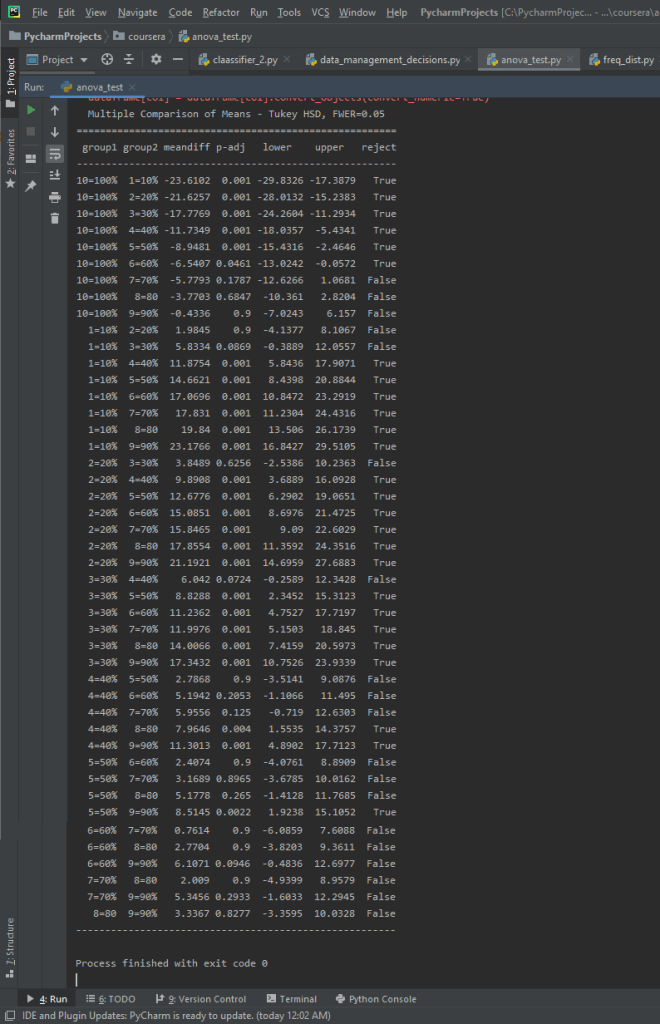
I’ll run an ANOVA on the life expectancy data and binned internet user rate data. I’ll make an ANOVA frame and another frame to check mean and standard deviation on. I then fit the stats OLS model and print out the results, along with the mean and standard dev to get more context.
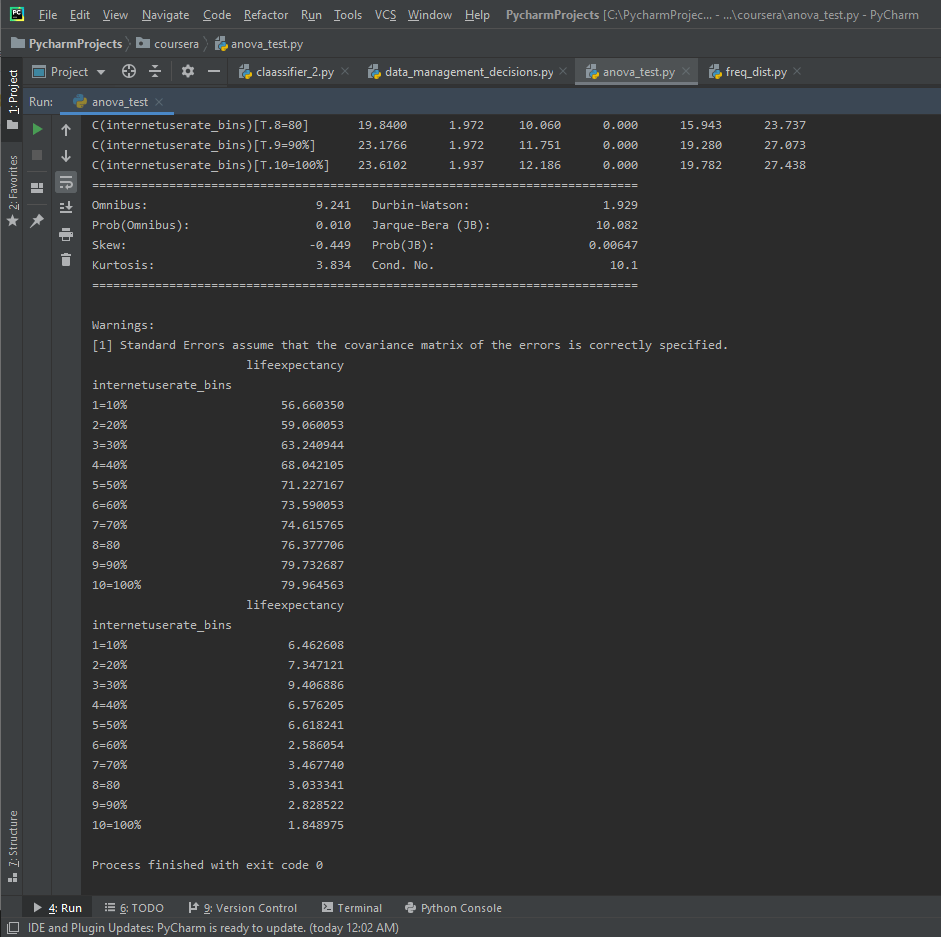
Here’s the mean and standard dev for the internet use rate and life expectancy.
The F-Score is 36.76, while the P-Value is 8.78e-34, which is a very small P-value. This seems to be a significant relationship. There are 10 different categories in the binned Internet Use Rate variables, and since the P-value is small enough to be significant we want to run a post-hoc comparison.
In this post I’ll be using exploratory data analysis techniques on the Gapminder dataset. I’ll be graphing some of the features in the dataset, with the primary variables of interest being Internet Use Rate and Life Expectancy. I’ve also included some analysis of secondary variables of interest, including Breast Cancer Rates Per 100k and Employment Rates.
To begin with, here’s the code I used to make the visualizations:
import seaborn as sns import pandas as pd import matplotlib.pyplot as plt
# check for missing data def check_missing(dataframe, cols):
for col in cols: print("Column {} is missing:".format(col)) print((dataframe[col].values == ' ').sum()) print()
# convert to numeric def to_numeric(dataframe, cols):
for col in cols: dataframe[col] = dataframe[col].convert_objects(convert_numeric=True)
# check frequency distribution def freq_dist(dataframe, cols, norm_cols):
for col in cols: print("Fred dist for: {}".format(col)) count = dataframe[col].value_counts(sort=False, dropna=False) print(count)
for col in norm_cols: print("Fred dist for: {}".format(col)) count = dataframe[col].value_counts(sort=False, dropna=False, normalize=True) print(count)
sns.distplot(df3['lifeexpectancy'].dropna()) plt.title("Life Expectancy Distribution") plt.show() sns.distplot(df3['internetuserate'].dropna()) plt.title("Internet Use Rate Distribution") plt.show() sns.countplot(x = "employrate_bins", data=df_employ) plt.title("Distribution of Employment Rates") plt.show()
sns.lmplot(x = "internetuserate", y="breastcancerper100th", hue="internetuserate_bins", data=df3, fit_reg=False) plt.title("Internet Use Rate and Breast Cancer Per 100k") plt.show()
sns.lmplot(x = "internetuserate", y="lifeexpectancy", hue="internetuserate_bins", data=df3, fit_reg=False) plt.title("Internet Use Rate and Life Expectancy") plt.show()
sns.lmplot(x = "internetuserate", y="employrate", hue="internetuserate_bins", data=df3, fit_reg=False) plt.title("Internet Use Rate and Employment Rate") plt.show()
Now let’s take a look at the visualizations themselves.
To begin with, here’s a distribution of life expectancy for the approximately 210+ countries tracked in the dataset.
The data is (arguably) bimodal, with two peaks. The first large peak is clustered around 70 years of age while a second smaller cluster is around 50 years of age.
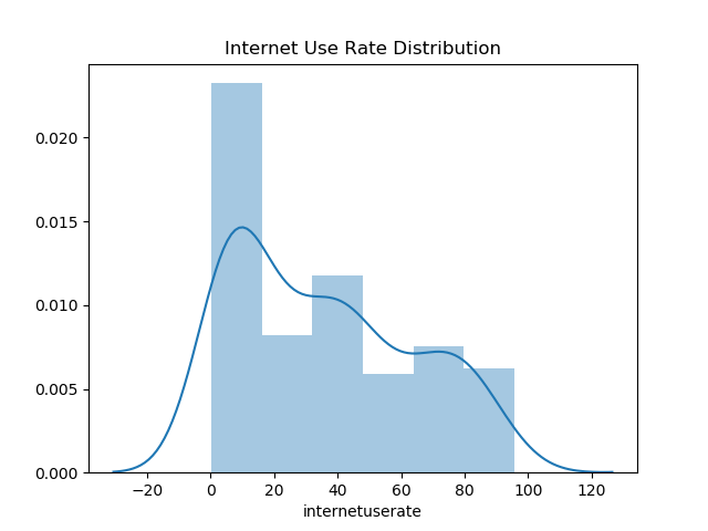
Now let’s have a look at the distribution for internet use rates.
The largest peak by far is between 0 – 10% internet use rate. This looks to be about 25% of the data distribution overall, so most countries have less internet access for less than half their population. I’d argue that the data is a unimodel distribution, although I suppose a second smaller peak is found at the 40% mark.
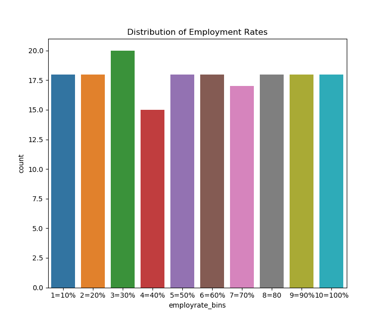
Let’s try graphing some of the binned data, which includes binned employment rates.
If we do this we can see that the data is fairly uniformally distributed, which we would expect given how the qcut function in Python works. However, there is a small bump around the 30th percentile and a small fall near the 40th percentile.
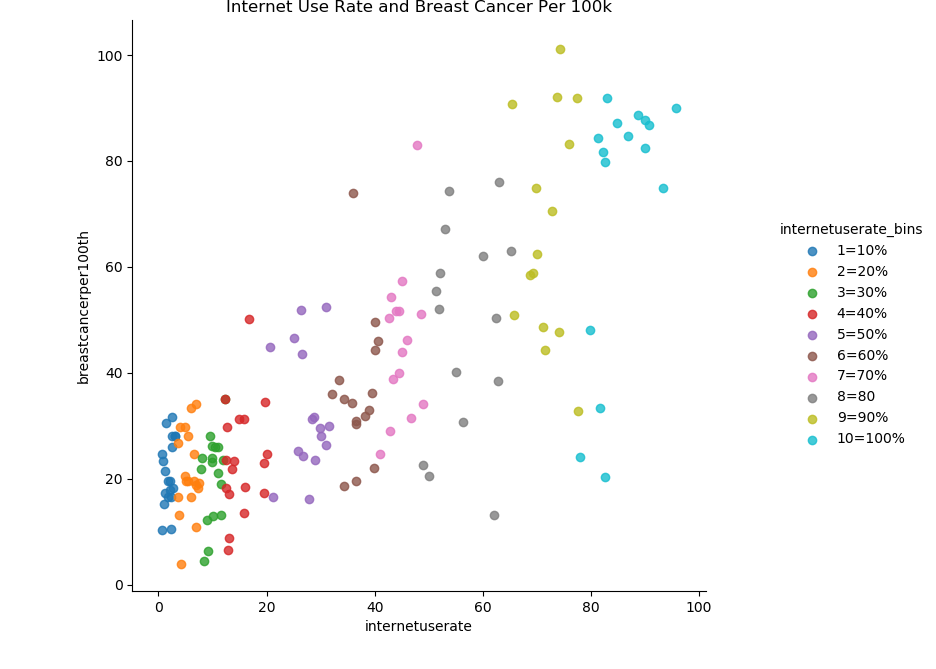
Now let’s try creating scatter plots for the continuous variables. First, we’ll try plotting the relationship between breast cancer diagnosis per 100k and internet use rate.
There seems to be a strong positive correlation between internet use rate and breast cancer diagnosis rates. Here’s an example of why we should be careful about inferring causation from correlation. It’s highly unlikely there’s some kind of causal mechanism between internet usage and breast cancer rates.
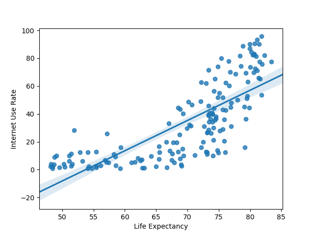
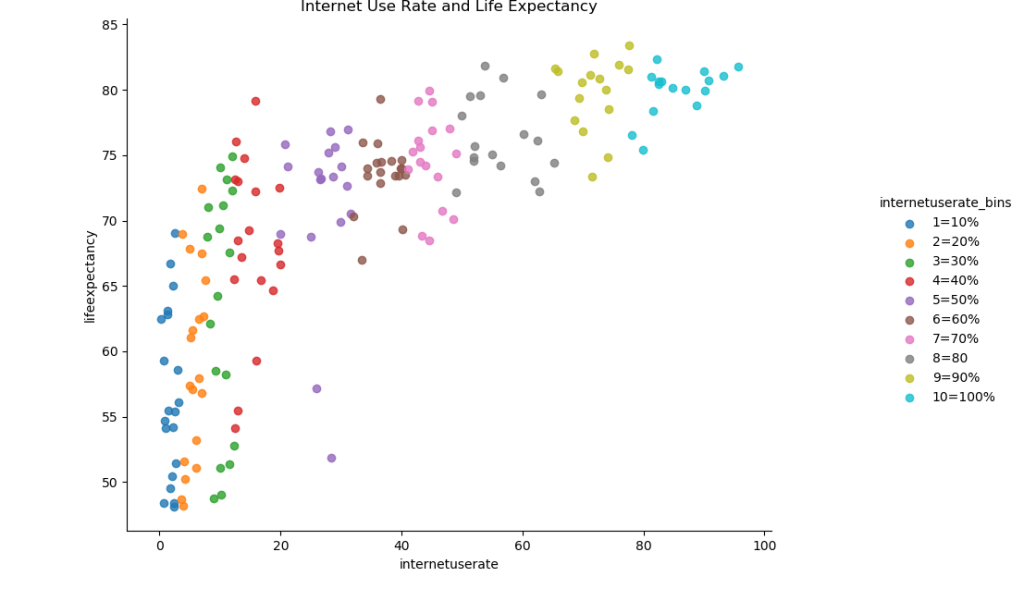
Now let’s try graphing the relationship between internet use rate and life expectancy.
There also seems to be a roughly positive correlation between internet use rate and life expectancy. There’s a massive increase in life expectancy as internet use rises from 0 to 20%, followed by a slower increase.
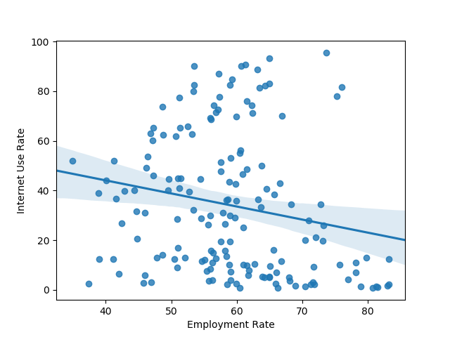
Now let’s try graphing the relationship between internet use and employment rates.
Here’s something I was a little surprised to find. It looks as if there’s a relationship between internet use and employment rate that’s roughly parabolic in nature. It looks as if there’s a decline in employment rate internet saturation increases up until the approximately 50% mark, and then the rate increases again.
After defining the functions we need, we’ll start off by loading in the data.
Afterwards, we’ll check to see if there’s any blank values.
import pandas as pd import numpy as np
# check for missing data def check_missing(dataframe, cols):
for col in cols: print("Column {} is missing:".format(col)) print((dataframe[col].values == ' ').sum()) print()
# convert to numeric def to_numeric(dataframe, cols):
for col in cols: dataframe[col] = dataframe[col].convert_objects(convert_numeric=True)
# check frequency distribution def freq_dist(dataframe, cols, norm_cols):
for col in cols: print("Fred dist for: {}".format(col)) count = dataframe[col].value_counts(sort=False, dropna=False) print(count)
for col in norm_cols: print("Fred dist for: {}".format(col)) count = dataframe[col].value_counts(sort=False, dropna=False, normalize=True) print(count)
The blank values have successfully been replaced with NaN. This is good because when we plot graphs later, we can just have Python ignore those NaN values. We’ve coded out the missing data with NaN.
I’ve also decided to experiment with bins. We’ll do one more thing and create five bins for our chosen features.
Here’s the code to do that:
def bin(dataframe, cols):

    for col in cols:
        new_col_name = "{}_bins".format(col)
        dataframe[new_col_name] = pd.qcut(dataframe[col], 5, labels=["1-20%", "21 to 40%", "40 to 60%", "60 to 80%", "80 to 100%"])

df3 = df2.copy()
bin(df3, cols)
bin(df3, norm_cols)

# print out the head and check the dataframe
print(df3.head())
Let’s print out the head of the dataframe to see if the values exist. It looks a little messy, but we can see that the new columns have successfully been created.
As mentioned in the last post, I am doing an analysis on the GapMinder dataset. I’ve selected five variables of interest: life expectancy, breast cancer per 100, suicide per 100, internet user rate, and employment rate. The first three variables do not need to be normalized, while the second two variables do. The code below loads in the data, makes two different lists (variables to normalize, and non-normalized) and then for the two lists returns a frequency distribution along with the five most common occurrence values. Jump to the bottom to see analysis of missing values and most common values.
import pandas as pd

# load data
dataframe = pd.read_csv("gapminder.csv")

#print(dataframe.head())
#print(dataframe.isnull().values.any())

# split into two lists
cols = ['lifeexpectancy', 'breastcancerper100th', 'suicideper100th']

norm_cols = ['internetuserate', 'employrate']

# print frequency distribution and 5 most common occurences
def freq_dist(dataframe, cols, norm_cols):

    for col in cols:
        print("Fred dist for: {}".format(col))

        count = dataframe[col].value_counts(sort=False)
        top_5 = dataframe[col].value_counts()[:4].index.tolist()
        print(count)
        print("Top 5 most common:")
        print(top_5)
        print("-----")

    for col in norm_cols:
        print("Fred dist for: {}".format(col))

        count = dataframe[col].value_counts(sort=False, normalize=True)
        top_5 = dataframe[col].value_counts()[:4].index.tolist()
        print(count)
        print("Top 5 most common:")
        print(top_5)
        print(count)


freq_dist(dataframe, cols, norm_cols)
Here’s the results of the frequency distributions:
Fred dist for: employrate Top 5 most common: [‘ ‘, ’65’, ‘55.9000015258789’, ‘61.5’]
Notice that blank is the most common value for all of them, this means we have quite a few cells that are just filled in with blank values. Finally, this checks to see if there are any blank cell values (blank does not mean missing):
for col in cols:
   print((dataframe[col].values == ' ').sum())

for col in norm_cols:
   print((dataframe[col].values == ' ').sum())
We do have a number of blank values for those columns:
I recently finished Hans Rosling’s book Factfulness: Ten Reasons We’re Wrong About the World, and I would love to do a research project that pays tribute to Rosling and Gapminder. For that reason I’ll be using the Gapminder study.
The primary topic I’m interested in is the relationship between internet usage and female employment. I’m curious about whether or not access to the internet might play a role in increasing life expectancy. For that reason, the two variables I’ll focus on are “Internetuserate” and “lifeexpectancy”. However, at this stage I’m not going to exclude any variables. I’m not sure yet which variables might be related in important ways to my chosen variables, so I’m going to keep everything at the moment. After some exploratory data analysis and more research, I’ll have a better idea of which variables to focus on.
I’m also curious about the relationship between internet usage and employment rates. There’s a lot of discussion right now that the internet can help job seekers gain more skills and become more employable, and I’m curious to see how strong the relationship between these two things are. Because of this, I’ll also include the “employrate” variable in my analysis.
(Upon further reflection, “breastcancerper100” and “suicideper100” might be interesting variables to track as well, as they related to physical and mental health.)
I used Google Scholar and my search terms were as follows:
“internet access and life expectancy”
“internet access and employment rates”
My initial search for relevant information about education and life-expectancy yielded the following results:
A handful of articles finding a relationship between internet usage and life expectancy or general health:
AMERICAN ECONOMIC REVIEW VOL. 94, NO. 1, MARCH 2004 (pp. 218-232)
To sum up:
My research questions are as follows:
“Is there a relationship between internet usage and life expectancy?” and beyond that “Is there a relationship between internet usage and employment rates”?
Based upon the sources I was able to find, I hypothesize there will be a positive relationship between internet usage and both life expectancy and employment rates. I would also expect breast cancer and suicide rates to trend down as internet access increases as they should be negatively correlated with life expectancy.
Mushrooms can be either toxic or edible. It takes trained mushroom hunters and mycologists to discern the toxic mushrooms from the edible mushrooms. Can machine learning algorithms also classify the edibility of mushrooms? We’ll visualize some of the data here, to get an idea of how the data is related, and then implement several different classifiers on the dataset.
This might go without saying, but don’t take advice about which mushrooms to eat from a random blog post. I do not condone eating any mushrooms based on the patterns revealed in this notebook or in the accompanying Python script or documentation.
To start with, we’ll import all the necessry modules that we need.
import pandas as pd
import seaborn as sns
import numpy as np
import matplotlib.pyplot as plt
from sklearn.preprocessing import LabelEncoder, StandardScaler
from sklearn.decomposition import PCA
from sklearn.metrics import accuracy_score, confusion_matrix, roc_auc_score, classification_report, log_loss
from sklearn.model_selection import train_test_split, cross_val_score
from sklearn.linear_model import LogisticRegression, SGDClassifier
from sklearn.naive_bayes import GaussianNB
from sklearn.svm import SVC
from sklearn.model_selection import GridSearchCV, RandomizedSearchCV
from sklearn.tree import DecisionTreeClassifier
from sklearn.neighbors import KNeighborsClassifier
from sklearn.ensemble import RandomForestClassifier, GradientBoostingClassifier
from xgboost import XGBClassifier
import warnings
warnings.filterwarnings("ignore")
We’ll load in the data for the mushrooms. Then we need to check if there is any null data in the dataset. There are only two classes: edible and poisonous. We can confirm that this is the case by printing the unique values of the class feature. We’re going to need to encode non-numerical data, that is, transform it into a form that our classifiers can use.
Scikit-Learn has a Label Encoder that will represent our non-numerical values as numerical ones. So we’ll create an instance of the encoder and then apply the transformation to every column in the dataset. We can print out the dataframe to be sure that there the transformations have been correct.
m_data = pd.read_csv('mushrooms.csv')

# check for any null values
print(m_data.isnull().sum())

# see all unique values in a category
print(m_data['class'].unique())

# machine learning systems work with integers, we need to encode these
# string characters into ints

encoder = LabelEncoder()
# now apply the transformation to all the columns:
for col in m_data.columns:
    m_data[col] = encoder.fit_transform(m_data[col])
Now we can do some plotting of the data. Using Matplotlib, let’s do a heatmap plot, which compares the correlation of every feature with every other feature.
# let's see how many poisonous and edible there are of each, 1 is poisonous, 0 is edible
# check to get a rough idea of correlations
correlations = m_data.corr()
plt.subplots(figsize=(20, 15))
#plt.figure(figsize=(16, 14))
data_corr = sns.heatmap(correlations, annot=True, linewidths=0.5, cmap="RdBu_r")
plt.show(data_corr)
It looks like the features most closely associated with class are: cap-surface, gill-attachment, gill-size, veil-color, spore-print-color, population, and habitat. Why don’t we see if we can plot the correlations of those variables individually.
features = ["cap-surface", "gill-attachment", "gill-size", "veil-color", "spore-print-color", "population", "habitat"]

for feature in features:
    line_plot = sns.lineplot(x="class", y=feature, label=feature, data=m_data)

plt.legend(loc=1)
plt.show()
If we are so inclined, we can chart how individual attributes are likely to correlate with a mushroom’s likelihood of beind poisonous. We just get the individual colors stored in the “gill-color” feature and we plot them against class. We need to specify the names of the gill-colors and choose colors to represent them in our plot, however.
Now we need to split our data into features and labels. This is easy because the “class” feature is the first in the dataframe, so all we need to do is cast the features as everything but the first column and do the opposite for the labels. We’ll also want to scale the data. Scaling our data is important as the data covers a wide range.
The sheer range of the data can throw off the accuracy of our classifier, so by standardizing the data we make sure our classifier performs optimally. We’ll create an instance of the classifier and then transform the data with it. We don’t need to scale the labels/targets as they are only 0 or 1.
X_features = m_data.iloc[:,1:23]
y_label = m_data.iloc[:, 0]

# we should probably scale the features, so that SVM or gaussian NB can deliver better predictions
scaler = StandardScaler()
X_features = scaler.fit_transform(X_features)
Principal Component Analysis is a method that can simplify the representation of features, distilling the most important features down into a combination of just a few features. PCA can help improve the outcome of a classifier. However, PCA works best when datasets are large, and since this dataset is relatively small, we may not want to do it. We can plot the conclusions of the PCA to see what kind of dimensions the data would be compressed to.
We fit the PCA on our features and plot the explained variance ratio. The explained variance ratio is a way of measuring how many features describe a given portion of the data. We can plot our this function to get an idea of how many features are needed to describe 90% or 100% of the data. Let’s plot the ratio.
# principal component analysis, may or may not want to do, small dataset
pca = PCA()
pca.fit_transform(X_features)
plt.figure(figsize=(10,10))
# plot the explained variance ratio
plt.plot(np.cumsum(pca.explained_variance_ratio_), 'ro-')
plt.grid()
plt.show()
# it looks like about 17 of the features account for about 95% of the variance in the dataset
Here’s another way that the explained variance can be plotted. Plotting it like this leads to the same conclusion: around 18 features describe 99% of the dataset.
# here's another way to visualize this
pca_variance = pca.explained_variance_

plt.figure(figsize=(8, 6))
plt.bar(range(22), pca_variance, alpha=0.5, align='center', label='individual variance')
plt.legend()
plt.ylabel('Variance ratio')
plt.xlabel('Principal components')
plt.show()
Let’s go ahead and create a new PCA object and use 17 or 18 features to comprise our new featureset.
Now we can select our chosen classifiers and run GridSearchCV to find their best possible parameters. GridSearchCV takes a specified list of parameters and tests the classifier with the potential combinatiosn of your schosen parameters to see which combination is best. Doing this should dramatically improve the performance of our classifiers compared to just implementing them vanilla. We have to fit GridSearchCV on the classifiers and our chosen parameters, and then save the optimized settings as a new instance of the classifier.
I highly recommend experimenting with the different classifiers to get a better idea of which classifiers work better under different circumstances. You can check out a list of classifiers supported by Scikit-learn here or here.
Previously, we’ve covered binary search and selection sort. This time, we’ll be covering another sorting algorithm – merge sort. Merge sort is a little different from selection sort. While selection sort can’ only be used to sort an unsorted list, merge sort can be utilized to merge two different sorted lists, in addition to sorting an unsorted list.
The core idea of merge sort is an instance of a divide and conquer approach. First, the entire list/array is split apart into left and right halves. Afterwards, the left half of the array is also divided in half. This recurs until there is only one element in the left and right halves, until the array halves cannot be split further. Afterwards, the values are merged together, being compared and place in sorted order.
This process recurs, gradually sorting and merging groups, until there is only one group with all the elements in their proper order. It is critical to remember that every-time a group is created the sorted order must be maintained.
Here’s an example of the technique, broken into dividing and merging phases.
Dividing Phase:
Assuming we have an array with the following values: [3, 8, 9, 2, 6, 7], the process will look something like this.
Division 1: [3, 8, 9][2, 6, 7]
Division 2: [3] [8, 9] [2] [6,7]
Division 3: [3] [8] [9] [2] [6] [7]
Now comes the merging phase.
Merging Phase:
Merge 1: [3, 8] [2,9] [6,7]
Merge 2: [2, 3, 8, 9][6, 7]
Merge 3: [2, 3, 6, 7, 8, 9]
If two lists are being merged, it is important to compare the elements before they are merged into a single list. Otherwise, the merged list will contain all the sorted elements of one list and then all the sorted elements of the other list.
So let’s make sure we understand the steps to implementing merge sort:
We start with an unsorted list and split it in half.
2. We split the left half of the array into halves.
3. We keep splitting until there is just one element per half.
4. We compare each of the elements
5. The elements are merged into one group, in order.
6. The process continues until the entire array has been sorted and merged.
Now we can try writing merge sort in Python.
This implementation will be a recursive implementation. When writing a recursive algorithm, remember that the algorithm must have a base-case, or a case where the recursion ends.
In order to implement merge sort in Python, the algorithm can be structured as follows:
def merge_sort(array): # Only if there are two or more elements if len(array) > 1: # get the midpoint in the array mid = len(array) // 2 # left half is everything before the mid left = array[:mid] # right half is everything after the midpoint right = array[mid:]
# recur the splits on the left and right halves merge_sort(left) merge_sort(right)
# we need variables to track the iteration through the arrays x = 0 y = 0
# Iterator for the main list z = 0
# here we copy the data into temporary arrays that store the left and right halves # as long as there are still values within the left and right half of the arrays # compare the values and swap positions
while x < len(left) and y < len(right): # if left value is smaller than the right value if left[x] <= right[y]: # place the left position into the sorted array array[z] = left[x] # update left position x = x + 1 else: array[z] = right[y] y = y + 1 # move to the next portion of the array z = z + 1
# If there are any elements left over in the left half of the array # We fill in the primary array with the remaining left values and then move the iterators up while x < len(left): array[z] = left[x] x += 1 z += 1
# Do the same thing for the right half of the array while y < len(right): array[z] = right[y] y += 1 z += 1
Analyzing reviews of media is a good way to get acquainted with data analysis and data science ideas/techniques. Because of the tendency for reviewers to give numerical scores to produces they review, it can be fairly easy to visualize how certain other features may correlate with these scores. This blog post will serve as an demonstration of how to analyze and explore data, using review data gathered from GameInformer.
I scraped the review data from GameInformer myself, and what follows is the results of the visualization/analysis. If you are curious about how the scraping was done:
Next, the review data was collected. Following this, some preprocessing was done to remove duplicate entries and non-standard characters from the review data.
This blog will also act as a quick primer on how to visualize data with Pandas and Seaborn.
Let’s start off by making all the necessary imports.
importpandasaspdimportseabornassnsfrommatplotlibimport pyplot as plt
fromcollectionsimport Counter
importcsv
Now we need to load in the data. We also need to get dummy representations of any non-numeric values.
We can get a violin plot for every reviewer. The width of the violins shows how often a particular score was assigned, while the height and length of a violin show the possible range of scores.
#---display violin plot for author and avg score

sns.lmplot(x='author', y='score', data=GI_data, hue='author', fit_reg=False)
sns.violinplot(x='author',y='score', data=GI_data)
plt.xticks(rotation=-90)
plt.show()
It’s possible to filter the database by multiple criteria. For instance, we could return every review over a certain score by a certain reviewer.
                                                title  score       author  \
48                                     Heaven's Vault      8  Elise Favis
58                                        Photographs      8  Elise Favis
102                                  Bury Me, My Love      8  Elise Favis
158              Life Is Strange 2: Episode 1 ? Roads      8  Elise Favis
243                                             Minit      8  Elise Favis
262                  Where The Water Tastes Like Wine      9  Elise Favis
266                                          Florence      8  Elise Favis
276                                        Subnautica      8  Elise Favis
286                              The Red Strings Club      8  Elise Favis
405                                            Tacoma      8  Elise Favis
442                                        Perception      8  Elise Favis
485                                  Thimbleweed Park      8  Elise Favis
506                                Night In The Woods      8  Elise Favis
586  Phoenix Wright: Ace Attorney - Spirit of Justice      8  Elise Favis
678                    Day of the Tentacle Remastered      8  Elise Favis

        r_platform                       o_platform  \
48              PC                    PlayStation 4
58              PC                     iOS, Android
102         Switch                 PC, iOS, Android
158             PC          PlayStation 4, Xbox One
243             PC  PlayStation 4, Xbox One, Switch
262             PC                PlayStation 4, PC
266            iOS                     Xbox One, PC
276             PC        PlayStation 4, Switch, PC
286             PC             Xbox One, Switch, PC
405             PC                         Xbox One
442             PC          PlayStation 4, Xbox One
485             PC                         Xbox One
506  PlayStation 4                               PC
586            3DS                               PC
678  PlayStation 4             PlayStation Vita, PC

                         publisher                           developer  \
48                           Inkle                               Inkle
58               EightyEight Games                   EightyEight Games
102                       Playdius   The Pixel Hunt, Arte France, FIGS
158                    Square Enix               Dontnod Entertainment
243               Devolver Digital           JW, Kitty, Jukio, and Dom
262     Good Shepard Entertainment      Dim Bulb Games, Serenity Forge
266          Annapurna Interactive               Annapurna Interactive
276   Unknown Worlds Entertainment        Unknown Worlds Entertainment
286               Devolver Digital                      Deconstructeam
405                     Fullbright                          Fullbright
442             The Deep End Games                  The Deep End Games
485                Terrible Toybox                     Terrible Toybox
506                          Finji                       Infinite Fall
586                         Capcom                              Capcom
678        Double Fine Productions             Double Fine Productions

            release_date           rating
48        April 16, 2019             Teen
58         April 3, 2019              NaN
102     January 10, 2019     Everyone 10+
158   September 27, 2018           Mature
243        April 3, 2018         Everyone
262    February 28, 2018        Not rated
266    February 14, 2018         Everyone
276     January 23, 2018     Everyone 10+
286     January 22, 2018   Rating Pending
405       August 2, 2017             Teen
442         May 30, 2017           Mature
485       March 30, 2017             Teen
506    February 21, 2017             Teen
586    September 8, 2016             Teen
678       March 22, 2016             Teen
Countplots and barplots are useful ways of visualizing data. Countplots just plot the count of your chosen variable, whereas bar plots compare two chosen variables with each other.
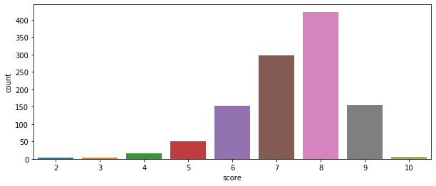
Seaborn also contains a handy distribution function, and in this case we can see the relative distribution of GameInformer review scores. Most of their assigned scores have been an 8.
sns.distplot(GI_data2['score'])
plt.show()
Swarmplots show the individual instances of Y given X, or in this case of a certain score given a certain rating.
Let’s do some analysis of publisher and developer statistics. We’d want to start by getting a list of publishers and developers. Let’s just get the 100 most common.
publishers = Counter(GI_data['publisher'])
developers = Counter(GI_data['developer'])

pub_list = []
dev_list = []

for item, freq in publishers.most_common(100):
    pub_list.append(item)

for item, freq in developers.most_common(100):
    dev_list.append(item)

print(pub_list[:10])
print("--------------")
print(dev_list[:10])
[' Nintendo', ' Telltale Games', ' Square Enix', ' Ubisoft', ' Sony Computer Entertainment', ' Devolver Digital', ' Warner Bros. Interactive', ' Microsoft Game Studios', ' Electronic Arts', ' Bandai Namco']
--------------
[' Telltale Games', ' Nintendo', ' Capcom', ' Square Enix', ' EA Tiburon', ' Atlus', ' Visual Concepts', ' EA Canada', ' Dontnod Entertainment', ' Ubisoft Montreal']
If we make a publisher and developer dataframe, we can transform those dataframes by getting the mean and median values of their scores. We can then merge those back into the original dataframe to get a dataframe sorted by publisher which also has the publisher’s mean and median scores. We could do the same thing for developers.
pub_df = pd.DataFrame(index=None)
dev_df = pd.DataFrame(index=None)
# append rows for individual publishers to dataframedef custom_mean(group):
group['mean'] = group['score'].mean()
return group
def custom_median(group):
group['median'] = group['score'].median()
return group
for pub in pub_list:
scores = pd.DataFrame(GI_data[(GI_data.publisher == pub) & (GI_data.score)], index=None)
pub_df = pub_df.append(scores, ignore_index=True)
pub_mean_df = pub_df.groupby('publisher').apply(custom_mean)
pub_median_df = pub_df.groupby('publisher').apply(custom_median)
pub_median = pub_median_df['median']
pub_merged_df = pub_mean_df.join(pub_median)
print(pub_merged_df.head(3))
pub_merged_df.to_csv('pub_merged.csv')
for dev in dev_list:
scores = pd.DataFrame(GI_data[(GI_data.developer == dev) & (GI_data.score)], index=None)
dev_df = dev_df.append(scores, ignore_index=True)
dev_mean_df = dev_df.groupby('developer').apply(custom_mean)
dev_median_df = dev_df.groupby('developer').apply(custom_median)
dev_median = dev_median_df['median']
dev_merged_df = dev_mean_df.join(dev_median)
dev_merged_df.to_csv('dev_merged.csv')
print(dev_merged_df.head(3))
                                               title  score  \
0                          Fire Emblem: Three Houses      9
1        Marvel Ultimate Alliance 3: The Black Order      7
2  Cadence of Hyrule ? Crypt of the Necrodancer F...      7

              author r_platform o_platform  publisher              developer  \
0  Kimberley Wallace     Switch        NaN   Nintendo    Intelligent Systems
1      Andrew Reiner     Switch        NaN   Nintendo             Team Ninja
2     Suriel Vazquez     Switch        NaN   Nintendo   Brace Yourself Games

     release_date           rating     mean  median
0   July 26, 2019              NaN  7.73913     7.0
1   July 19, 2019             Teen  7.73913     7.0
2   June 13, 2019   Rating Pending  7.73913     7.0
                                              title  score             author  \
0                The Walking Dead: The Final Season      7  Kimberley Wallace
1    The Walking Dead: The Final Season ? Episode 1      7  Kimberley Wallace
2  Batman: The Enemy Within Episode 5 ? Same Stitch      9      Javy Gwaltney

      r_platform                       o_platform        publisher  \
0  PlayStation 4             Xbox One, Switch, PC   Telltale Games
1             PC          PlayStation 4, Xbox One   Telltale Games
2  PlayStation 4  PlayStation 4, Xbox One, Switch   Telltale Games

         developer      release_date           rating  mean  median
0   Telltale Games    March 27, 2019   Rating Pending  7.16     7.0
1   Telltale Games   August 14, 2018           Mature  7.16     7.0
2   Telltale Games    March 27, 2018           Mature  7.16     7.0
Let’s select just the top publishers and see what their mean and median scores are.
dev_data = pd.read_csv('dev_merged.csv')
dev_data = dev_data.drop(dev_data.columns[0], axis=1)
developer_names = list(dev_data['developer'].unique())
#print(developer_names)

dev_examples = pd.DataFrame(index=None)

for dev in developer_names:
   dev_examples = dev_examples.append(dev_data[dev_data.developer == dev].iloc[0])

#print(dev_examples.to_string())

dev_stats = dev_examples[['developer', 'mean', 'median']]
print(dev_stats.head(20))
                    developer      mean  median
0              Telltale Games  7.160000     7.0
25                   Nintendo  7.714286     7.0
39                     Capcom  7.857143     9.0
46                Square Enix  8.111111     9.0
55                 EA Tiburon  6.666667     7.0
61                      Atlus  7.666667     7.0
67            Visual Concepts  7.666667     7.0
76                  EA Canada  7.000000     7.0
80      Dontnod Entertainment  7.000000     7.0
83           Ubisoft Montreal  7.000000     7.0
87              Firaxis Games  8.428571     9.0
94                   TT Games  7.666667     7.0
97     Blizzard Entertainment  9.000000     9.0
104             From Software  8.714286     9.0
111                Game Freak  7.000000     7.0
113   Double Fine Productions  7.666667     7.0
116       Intelligent Systems  8.200000     9.0
121                      SEGA  8.600000     9.0
126            HAL Laboratory  7.000000     7.0
127            Spike Chunsoft  6.000000     6.0
Another interesting thing we could to is get the worst reviewed games, games that have received less than a 4.
# how you can filter for just one criteria and then pull out only the columns you care about# print(GI_data[GI_data.score <= 4].title)# this is actually the preferred method...
print(GI_data.loc[GI_data.score <= 4, 'title'])
69               R.B.I. Baseball 19
124     Overkill's The Walking Dead
134                   The Quiet Man
217               Tennis World Tour
220                           Agony
259               Fear Effect Sedna
301                  Hello Neighbor
343              Raid: World War II
483              R.B.I. Baseball 17
488                 Old Time Hockey
489                 Old Time Hockey
503                      1-2-Switch
589                    One Way Trip
612             Ghostbusters (2016)
637       Homefront: The Revolution
722                   Devil's Third
767                        Armikrog
815                        Godzilla
820     Payday 2: Crimewave Edition
933              Escape Dead Island
935       Sonic Boom: Rise of Lyric
1045          Rambo: The Video Game
1063                         Rekoil
Name: title, dtype: object
We could also get only published by Nintendo by filtering out results where ‘Nintendo’ doesn’t appear in ‘publisher’ with isin.
# can use "isin" in a series...# spaces are in this, be sure to include them
r = GI_data[GI_data['publisher'].isin([' Nintendo'])][:40]
print(r)
                                                 title  score  \
0                            Fire Emblem: Three Houses      9
5          Marvel Ultimate Alliance 3: The Black Order      7
6                                      Dr. Mario World      8
19                                 Super Mario Maker 2      8
23   Cadence of Hyrule ? Crypt of the Necrodancer F...      7
43                                  BoxBoy! + BoxGirl!      8
64                               Yoshi's Crafted World      8
79                                           Tetris 99      8
101  Mario & Luigi: Bowser's Inside Story + Bowser ...      8
103                     New Super Mario Bros. U Deluxe      8
112                         Super Smash Bros. Ultimate      9
123                         Pokémon: Let's Go, Pikachu      8
144               The World Ends With You: Final Remix      7
151                                  Super Mario Party      7
161  Xenoblade Chronicles 2: Torna - The Golden Cou...      7
193                                          Tetris 99      8
196                                     WarioWare Gold      8
199                                  Octopath Traveler      8
202                     Captain Toad: Treasure Tracker      8
203                         Splatoon 2: Octo Expansion      8
209                                  Mario Tennis Aces      8
212                                      Pokémon Quest      6
215                  Sushi Striker: The Way of Sushido      7
216                        Dillon's Dead-Heat Breakers      7
236               Donkey Kong Country: Tropical Freeze      9
246                                  Detective Pikachu      7
254                                  Kirby Star Allies      6
300  The Legend Of Zelda: Breath Of The Wild ? The ...      8
308                             Xenoblade Chronicles 2      7
335                                Super Mario Odyssey      9
338                               Fire Emblem Warriors      7
377                             Metroid: Samus Returns      9
378                             Monster Hunter Stories      8
408                                           Miitopia      7
410                                        Hey! Pikmin      6
413                                         Splatoon 2      8
418  The Legend Of Zelda: Breath Of The Wild ? Mast...      7
426                                         Ever Oasis      8
431                                               Arms      8
447            Fire Emblem Echoes: Shadows of Valentia      7

                author r_platform                                 o_platform  \
0    Kimberley Wallace     Switch                                        NaN
5        Andrew Reiner     Switch                                        NaN
6           Ben Reeves        iOS                                    Android
19       Kyle Hilliard     Switch                                        NaN
23      Suriel Vazquez     Switch                                        NaN
43          Ben Reeves     Switch                                        NaN
64          Brian Shea     Switch                                        NaN
79       Kyle Hilliard     Switch                               Xbox One, PC
101      Kyle Hilliard        3DS                                   Xbox One
103         Brian Shea     Switch                           PC, iOS, Android
112          Jeff Cork     Switch                          PlayStation 4, PC
123         Brian Shea     Switch                              PlayStation 4
144  Kimberley Wallace     Switch                                         PC
151         Brian Shea     Switch            PlayStation 4, Xbox One, Switch
161           Joe Juba     Switch             PlayStation 4, Switch, PC, Mac
193      Kyle Hilliard     Switch            PlayStation 4, Xbox One, Switch
196      Kyle Hilliard        3DS            PlayStation 4, PlayStation Vita
199           Joe Juba     Switch  PlayStation 4, Xbox One, Switch, Mac, iOS
202         Ben Reeves     Switch                                        3DS
203         Brian Shea     Switch                                        3DS
209      Kyle Hilliard     Switch                          PlayStation 4, PC
212         Brian Shea     Switch                               iOS, Android
215      Kyle Hilliard     Switch                                        3DS
216      Kyle Hilliard        3DS                                        3DS
236      Kyle Hilliard     Switch                                      Wii U
246         Ben Reeves        3DS            PlayStation 4, Xbox One, Switch
254      Kyle Hilliard     Switch                               Xbox One, PC
300     Suriel Vazquez     Switch                               Xbox One, PC
308           Joe Juba     Switch                    PlayStation 4, Xbox One
335      Andrew Reiner     Switch                       Xbox One, Switch, PC
338      Javy Gwaltney     Switch                          PlayStation 4, PC
377         Ben Reeves        3DS                               Xbox One, PC
378        Daniel Tack        3DS                               Xbox One, PC
408          Jeff Cork        3DS                                   Xbox One
410         Ben Reeves        3DS                              PlayStation 4
413         Brian Shea     Switch                                         PC
418      Javy Gwaltney     Switch            Xbox One, PC, Mac, iOS, Android
426      Kyle Hilliard        3DS                 Xbox One, PlayStation Vita
431         Brian Shea     Switch                              PlayStation 3
447      Javy Gwaltney        3DS                       Xbox One, Switch, PC

     publisher                       developer         release_date  \
0     Nintendo             Intelligent Systems        July 26, 2019
5     Nintendo                      Team Ninja        July 19, 2019
6     Nintendo                        Nintendo        July 10, 2019
19    Nintendo                        Nintendo        June 28, 2019
23    Nintendo            Brace Yourself Games        June 13, 2019
43    Nintendo                  HAL Laboratory       April 26, 2019
64    Nintendo                       Good Feel       March 29, 2019
79    Nintendo                           Arika    February 13, 2019
101   Nintendo                      AlphaDream     January 11, 2019
103   Nintendo                        Nintendo     January 11, 2019
112   Nintendo                       Sora, Ltd     December 7, 2018
123   Nintendo                      Game Freak    November 16, 2018
144   Nintendo           Square Enix, h.a.n.d.     October 12, 2018
151   Nintendo                        Nintendo      October 5, 2018
161   Nintendo                   Monolith Soft   September 14, 2018
193   Nintendo                           Arika    February 13, 2019
196   Nintendo   Nintendo, Intelligent Systems       August 3, 2018
199   Nintendo            Square Enix, Acquire        July 13, 2018
202   Nintendo                        Nintendo        July 13, 2018
203   Nintendo                        Nintendo        June 13, 2018
209   Nintendo                Camelot Software        June 22, 2018
212   Nintendo                      Game Freak         May 29, 2018
215   Nintendo           Nintendo, indies zero         June 8, 2018
216   Nintendo                         Vanpool         May 24, 2018
236   Nintendo                   Retro Studios          May 4, 2018
246   Nintendo                  Creatures Inc.       March 23, 2018
254   Nintendo                  HAL Laboratory       March 16, 2018
300   Nintendo                        Nintendo     December 7, 2017
308   Nintendo                   Monolith Soft     December 1, 2017
335   Nintendo                        Nintendo     October 27, 2017
338   Nintendo                      Koei Tecmo                  TBA
377   Nintendo                    MercurySteam   September 15, 2017
378   Nintendo                          Capcom    September 8, 2017
408   Nintendo                        Nintendo        July 27, 2017
410   Nintendo                        Nintendo        July 28, 2017
413   Nintendo                        Nintendo        July 21, 2017
418   Nintendo                        Nintendo        July 30, 2017
426   Nintendo                          Grezzo        June 23, 2017
431   Nintendo                        Nintendo        June 16, 2017
447   Nintendo             Intelligent Systems         May 19, 2017

              rating
0                NaN
5               Teen
6           Everyone
19               NaN
23    Rating Pending
43          Everyone
64          Everyone
79          Everyone
101         Everyone
103         Everyone
112           Mature
123         Everyone
144             Teen
151         Everyone
161             Teen
193             Teen
196     Everyone 10+
199             Teen
202         Everyone
203     Everyone 10+
209         Everyone
212         Everyone
215         Everyone
216         Everyone
236         Everyone
246         Everyone
254     Everyone 10+
300         Everyone
308             Teen
335     Everyone 10+
338   Rating Pending
377     Everyone 10+
378     Everyone 10+
408         Everyone
410     Everyone 10+
413     Everyone 10+
418         Everyone
426     Everyone 10+
431     Everyone 10+
447   Rating Pending
Finally, let’s do a swarmplot of scores by Nintendo associated developers. We’ll take games published by Nintendo and plot the score given some developers.
If you’d like to get better acquainted with visualizing data, I suggest checking out the documentation of Pandas and Seaborn and trying to visualize some simple datasets, such as the ones below: